Designing a destination for continuous discovery
Museum of Contemporary Art Australia
Background
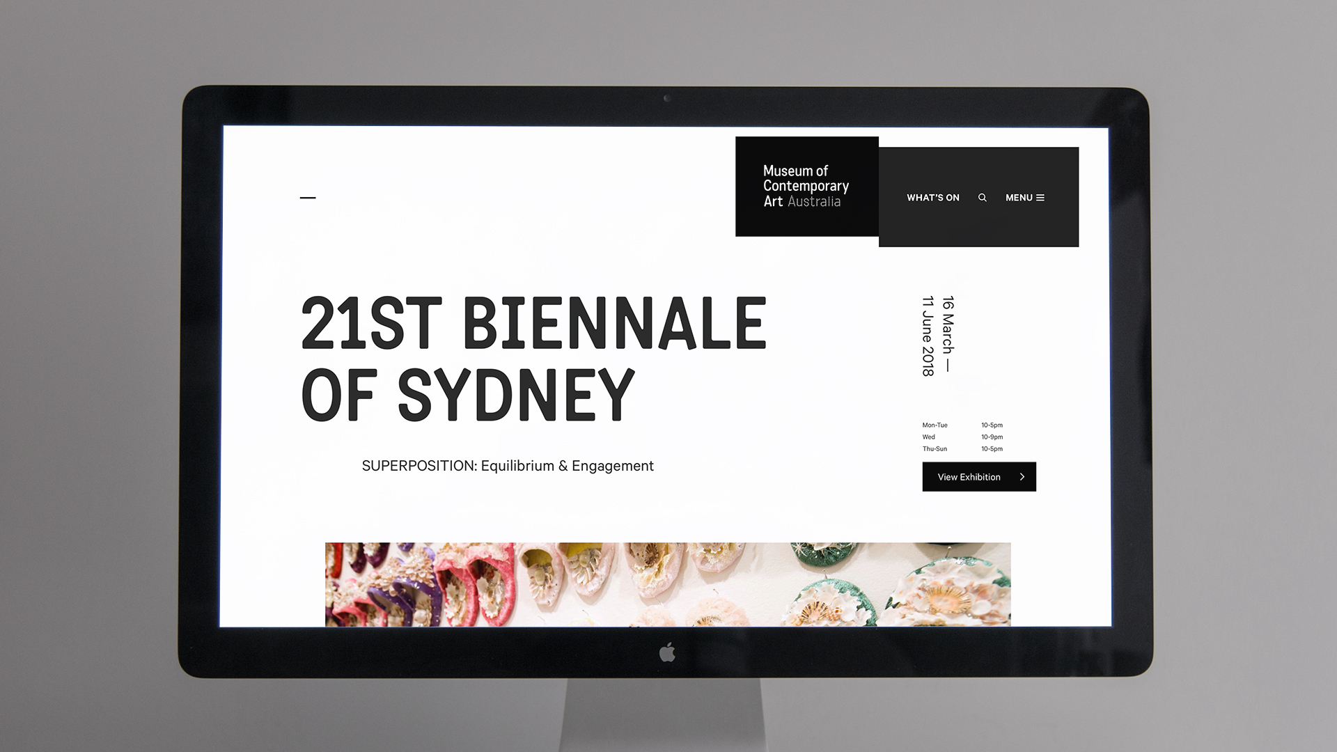
In 2017, the Museum of Contemporary Art (MCA) Australia tapped Pollen to completely redesign their website.
Their website, home to their collection of more than 400 digitised works from over 300 artists, was outdated and they wanted a new platform that engaged new and existing audiences with contemporary art, artists, stories and ideas.

Discovery
After our initial project context session, we dove into a series of interviews and co-design workshops with the MCA’s stakeholders, audience, members, digital team, content team and Artist Advisory Group. Here, we developed a deep understanding the role the new website needed to play, and the jobs it needed to perform for its business and users.
At this stage, I was also responsible for conducting a current-state site review, analytics review and competitor review, generating key insights that would inform the strategic directions of the new site.

Strategic Directions
Taking our learnings from discovery, we defined a key set of principles that reflected the goals and desires of the MCA. The new website needed to:
Put the artist at the heart
Promote and interweave artist content and interviews across the site.
Foster better content discovery
Although the website was used by hundreds of thousands of people per year, it received only a small percentage of traffic to it’s art and artist pages. We needed to create a high quality user experience that deepened audience engagement with the site and encouraged the exploration of art and artist content, and established the MCA as a content destination in its own right.
Tell all kinds of stories
The new platform needed to enable the MCA to tell the story of their artists and artworks in a rich a way as possible.
Offer a dynamic and immersive art experience
The new website needed to allow for more engaging content to form part of the overall page narrative.
Support the lifelong learner
Better integrate educational outcomes and content into the artwork, artist, collection and exhibition contexts.
Support future growth
We needed to create a more flexible platform that was easier to maintain, and that would support current and future growth.
Mapping it out
With the MCA happy with this direction, we then worked closely with the team to create an extensive product roadmap that detailed the requirements and goals for the new platform.
Designing for flexibility
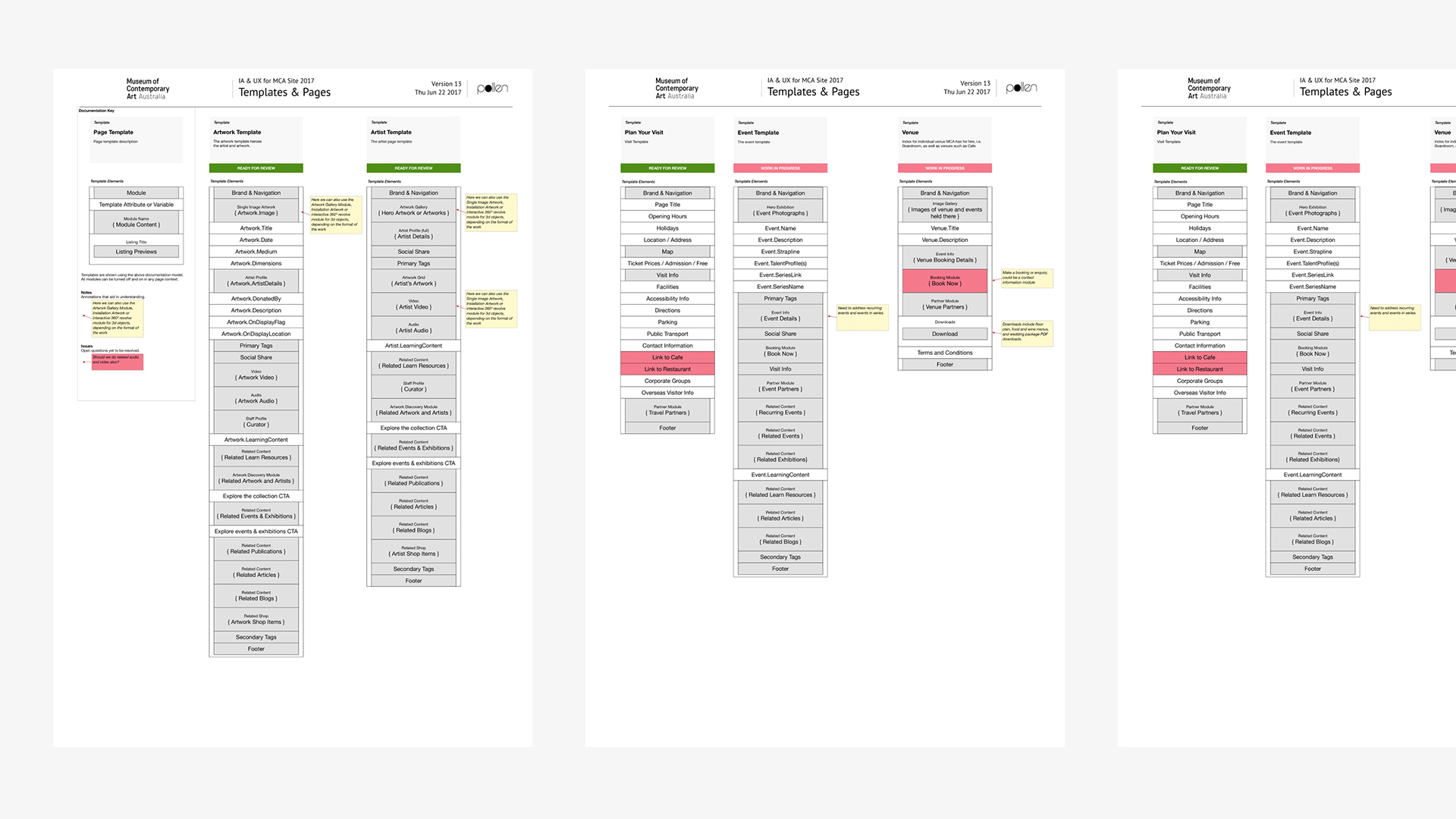
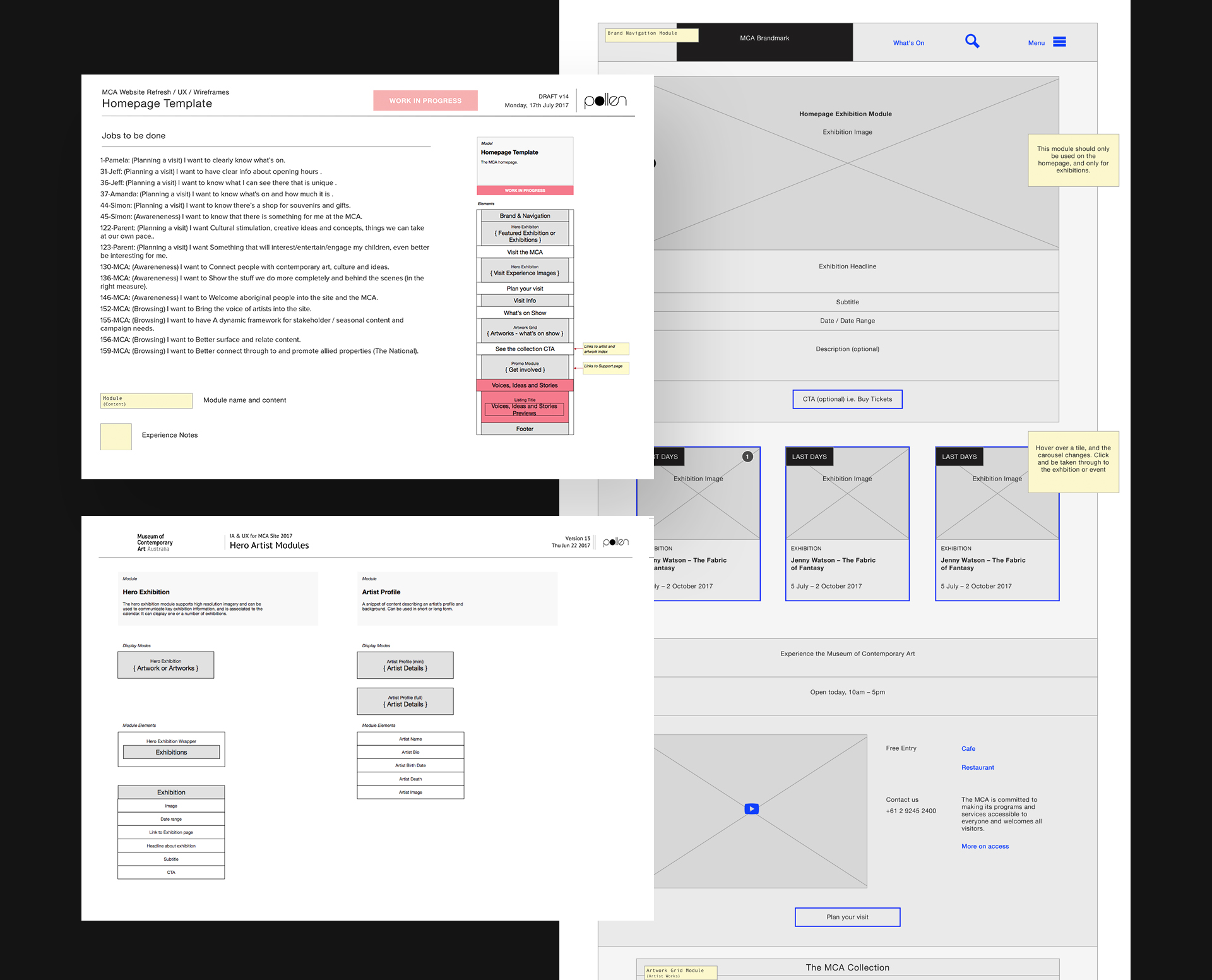
I was then tasked with taking the product roadmap and translating it into a system of flexible modules and page templates that could be used consistently across the site for a wide range of content purposes.
With such a varied audience, the MCA website needed to house a diverse range of programs, projects and content - everything from ‘ARTBAR’ to ‘Art & Dementia’.
To ensure we met all these needs, we allocated key jobs-to-be-done against each individual page template and module we delivered.
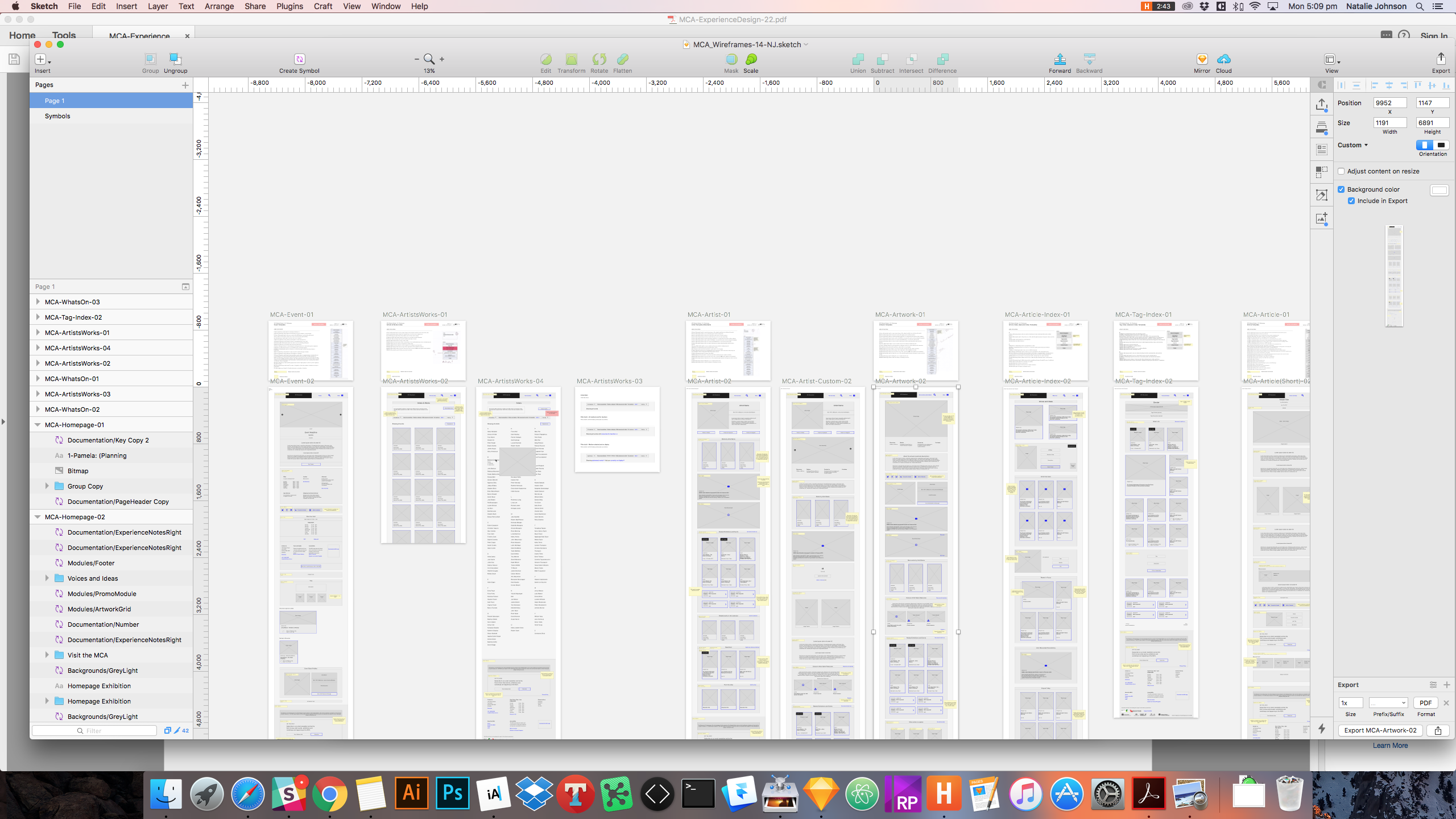
This project also saw the development of the “wireframework”, a Sketch-based solution for creating low to medium fidelity component-based wireframe systems using a single symbol block. Using the wireframework, I was able to create and combine blocks into symbols that could be used to quickly build out entire pages.
A new visual language
At Pollen, Ross, Evan Bohringer and Brett Walsh were responsible for the concept and overall design of the new website. Evan worked closely with the MCA’s design team throughout the project to establish a visual language fit for the web, and create a unique experience in the spirit of the museum’s forward thinking brand and reputation.
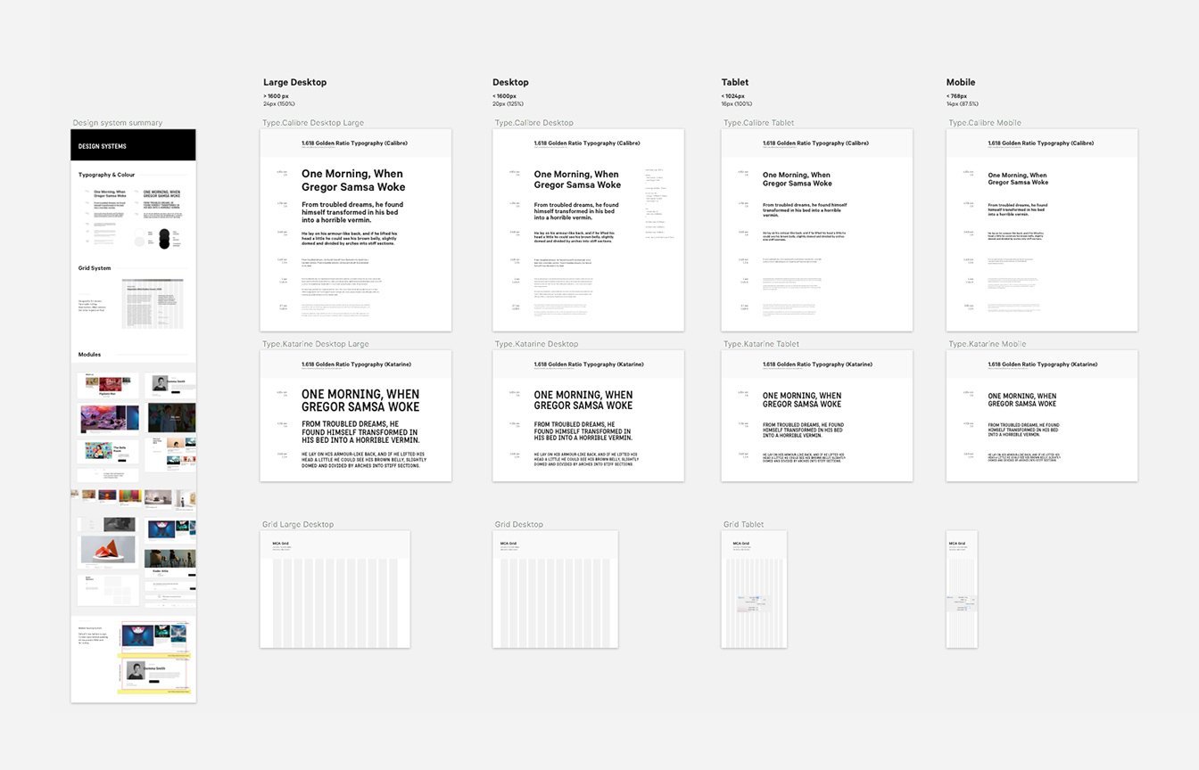
Throughout the project, I worked closely with design, development and content teams to help meet the goals of the project. I also helped solve a number of UX challenges that presented throughout the process:
Designing for discovery
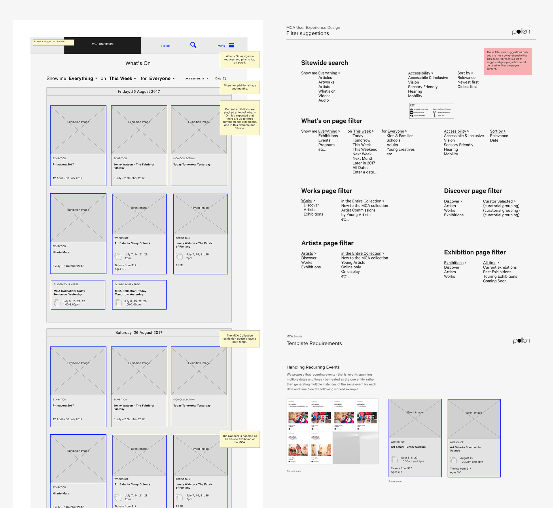
The entire experience was designed to empower users to discover the breadth and depth of content that the MCA has to offer. We designed a range of ‘discovery modules’ that would house thoughtfully-curated content to encourage deeper exploration of the MCA website.
The site search also furthers discovery and exploration, helping users find their way across the site while deepening their engagement with the subject of their search.
Complex event scenarios
The MCA had a number of different ways to represent exhibitions, events, recurring events and event series. I designed how events should be handled and displayed, enabling users to browse multiple dates of the same event and book from a single event page.
Interaction design
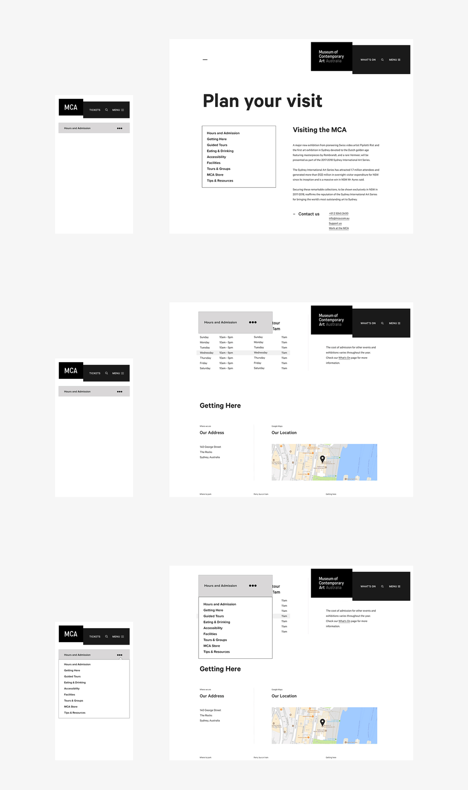
The MCA were keen to push “best practices” and implement bold interactions. The site’s mega menu, for instance, took cues from the museum’s cutting-edge facade. Although innovative, the unique design meant we couldn’t rely on more standard sub-navigation patterns. I devised new secondary and sub-navigation patterns that were used across the website.
Results
After an extensive QA and testing period, the new MCA website went live. Visit the new website or read more about the project here.
Pollen and the MCA continue to evolve the new platform to better serve their audiences and engage them with contemporary art, culture, stories and ideas.