An interactive library tour experience
Western Sydney University Library
The challenge
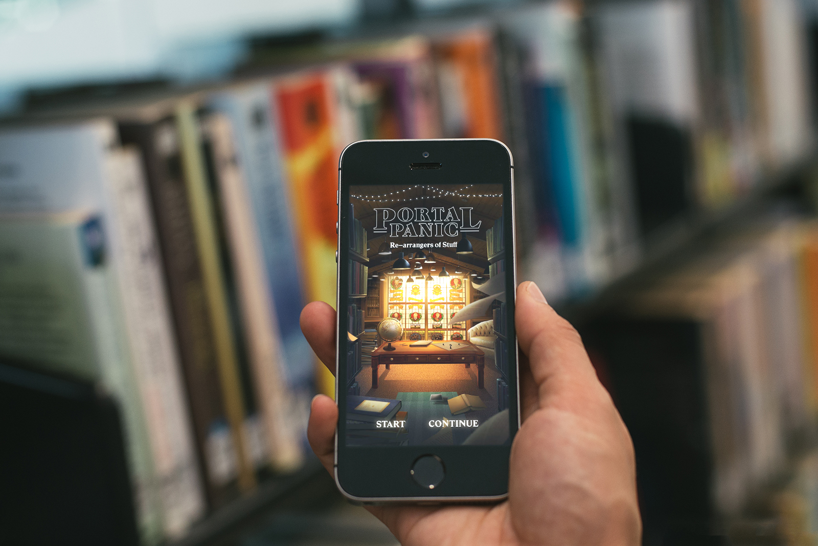
In 2016, Western Sydney University (WSU) Library approached me wanting to create a web app for their 2017 Orientation Weeks. They wanted to create a novel and self-guided way for new students to interact with the library’s services, while engaging with some of the traditional learning outcomes of a traditional library tour, and envisioned an escape room-style experience inspired by cult-tv show Stranger Things.
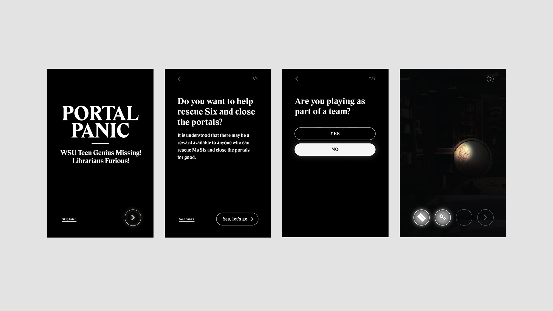
To help bring the idea to life, I bought on board illustrator Kallie Ennever and software engineer Brice Fernandes. Working closely with the team at WSU Library, we developed ‘Portal Panic’, an app that told the story of ‘Six’, a research student who had disappeared into a portal and needed to be found. Students used the app to explore the library, pick up clues, solve puzzles and unlock levels, rescuing Six and closing all the portals forever.
Gathering requirements
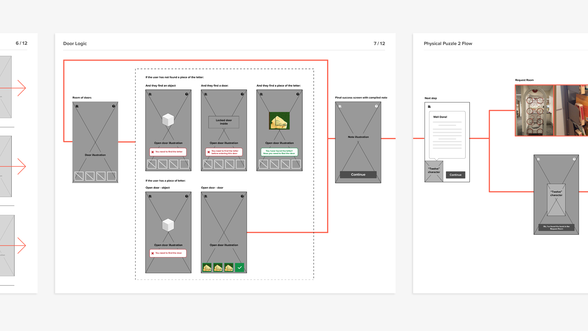
To begin, we conducted on-site walkthroughs of the proposed library tour activities at both WSU’s Hawkesbury and Parramatta campuses. I then worked to translate the entire, end-to-end experience into a flow map, outlining how the physical and digital touchpoints of the tour would interact.
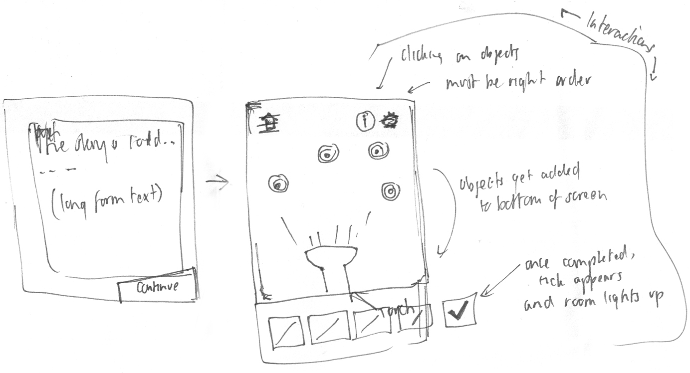
Using the flow map as our foundation, Kallie, Brice and I worked together to specify the more detailed interactions of the app. We thought about how we might tell a story, embed principles of gamification, and bring in elements of the ‘upside down’ into the app.
Prototyping into production
With only 6 weeks to deliver the final ‘Portal Panic’ web application, we decided to develop a prototype that would evolve into the final, fully functional application. To keep the development side of things simple, Brice built the app as a single page jQuery application with a Firebase backend.
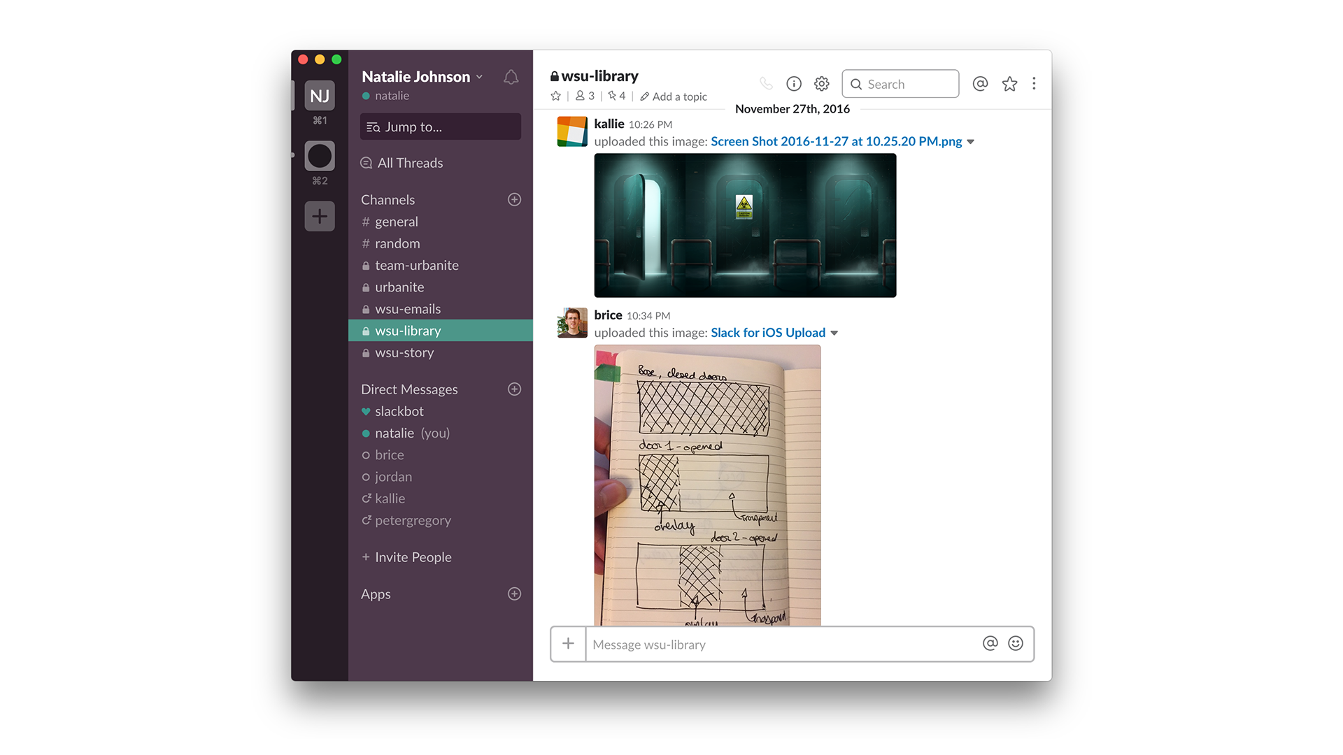
Over the course of the project, Kallie, Brice and I worked collaboratively over Skype and Slack. We discussed ideas often by designing them directly into the browser – with Kallie creating rough mockups and then sending them through to Brice, who would then quickly pull together a working interaction for us all to review and expand upon.
Test & refine
To meet the project’s tight timelines, we worked in weekly sprints. At the end of each week, we would deployed the working prototype and would send through the URL to the team at WSU Library.
Alongside the prototype, we also delivered a screencast explaining the features, known bugs and future improvements that would be made in the following week’s release. The team at WSU Library would then test the prototype and subsequently feedback on changes, ideas, bugs and usability issues the next day over email and Skype.
My primary role at this phase was to make sure that we, as a team, met all the requirements and changes that were fed back from WSU Library. I also performed front-end development and made UI refinements, working closely with Kallie to create a cohesive visual language and ensure consistent interaction patterns throughout the app.
Track & measure
WSU Library project managers also required a way to track and report on individual users’ activity in the app. During the final week of the project, Brice and I worked together to build a custom analytics report that provided insights into user activity, behaviour and engagement within the app. The custom report page also provides WSU Library with a way to download raw user data to use in their own reports.
Launch & impact
In just 9 weeks, we designed, developed and delivered a fully functional application with its own analytics portal. The final result is a novel library tour experience that lets WSU Library onboard new students, wherever and whenever they would like.
Portal Panic launched across all six of WSU’s campus libraries during orientation weeks in February 2017. The app received 266 unique registrations and garnered positive user feedback.
Going forward, WSU Library has recognised Portal Panic app as a viable alternative to traditional library tours, and has continued the use of the app throughout 2017 and into 2018.
Ongoing improvements
As part of our handover, Brice taught the team at WSU Library how to perform basic development tasks, including HTML editing, version control and deployment.
In response to insights from the analytics and student feedback, WSU Library has since been able to build on this app over time. During 2017, the team at WSU Library updated and deployed various iterations of the app, and continues to do so into 2018.
Things we learned
We were really happy with the way the app turned out, and even more so with the way we were able to work quickly as a team to collaboratively build and evolve the prototype. Here are a few things we learned along the way: